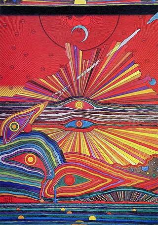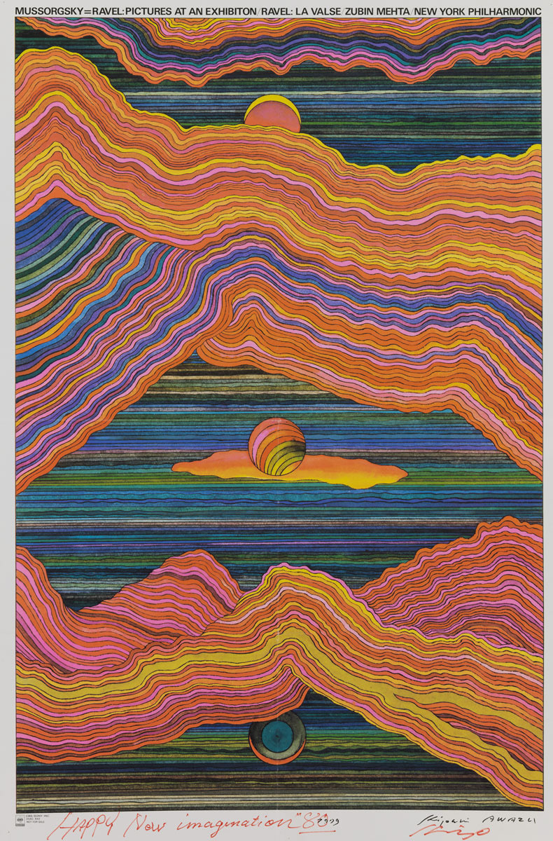
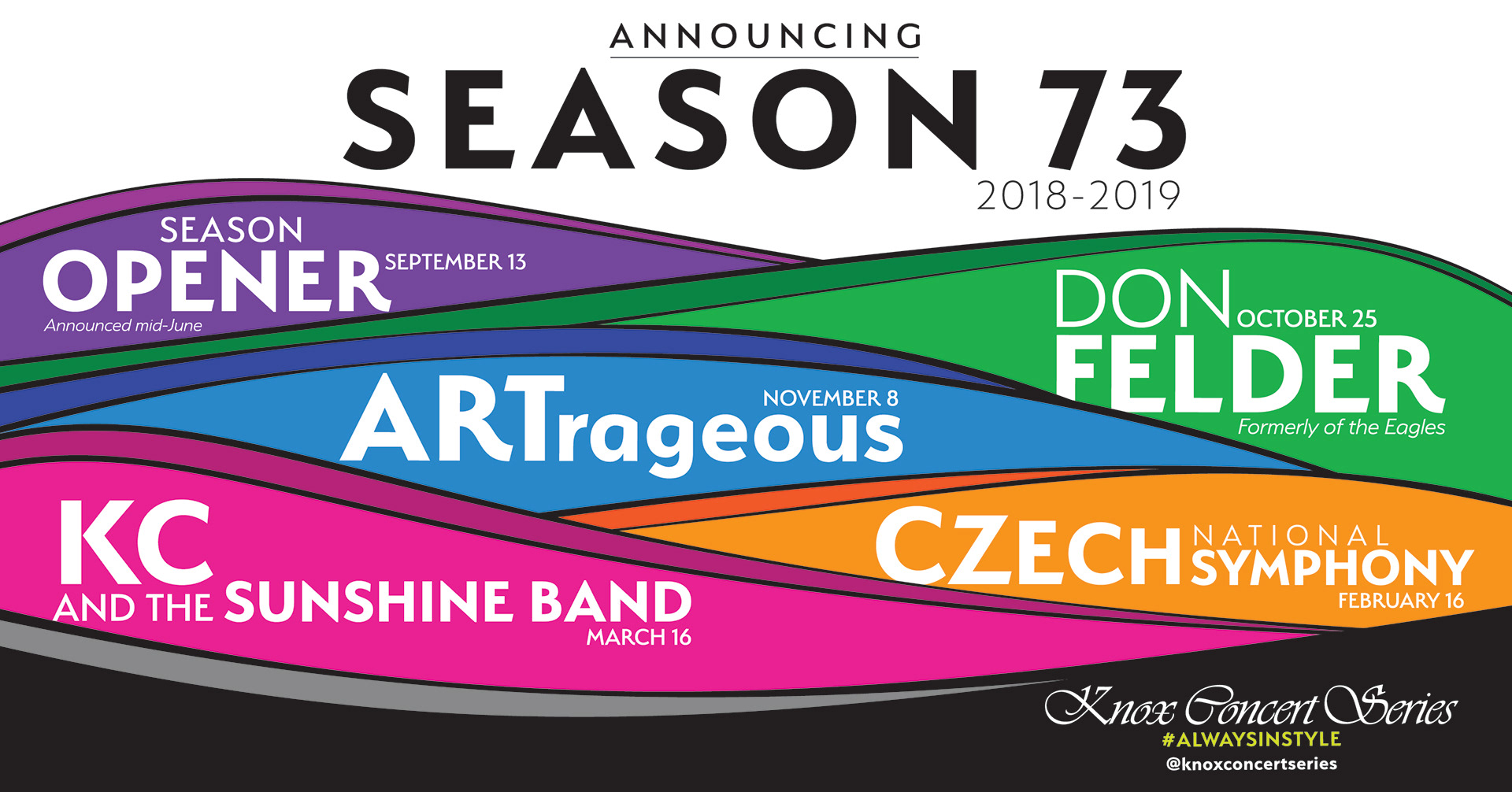
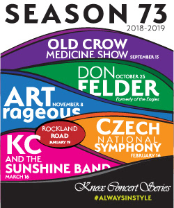
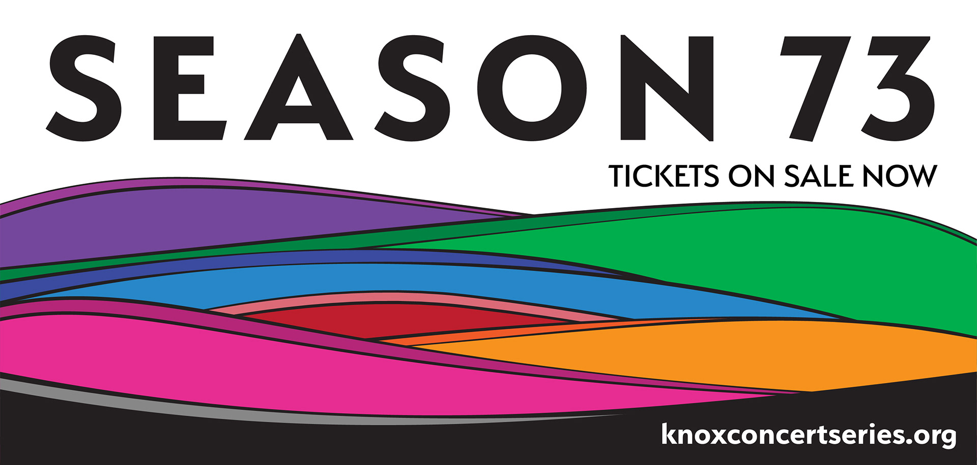
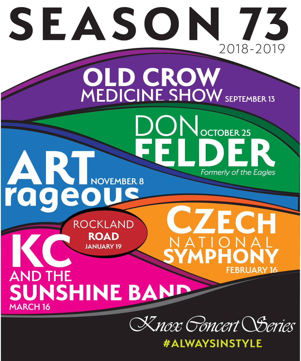
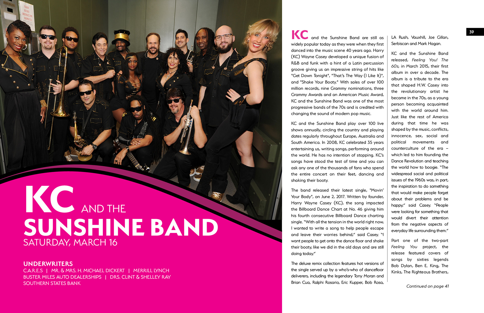
In the early stages of the campaign's development, the organization had booked a few concerts, one of which was KC and the Sunshine Band. This became the inspiration for the 70's-era aesthetic of the campaign. A landscape inspired by the work of Kiyoshi Awazu was applied to campaign materials throughout the year. "Serenity" typeface was used.
Direct mail postcard.
Digital display ad
Social media header
Posters and large-format signs

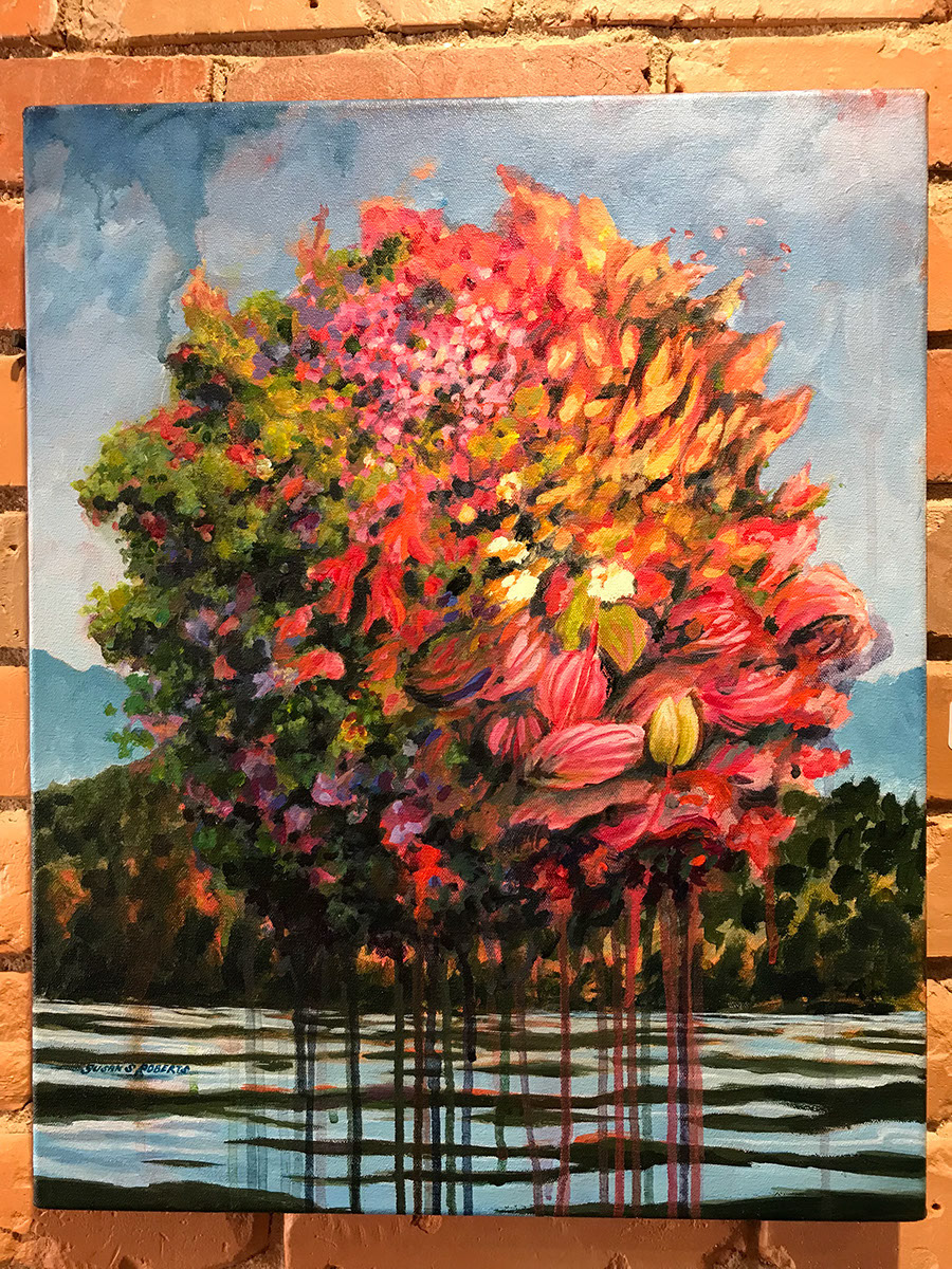
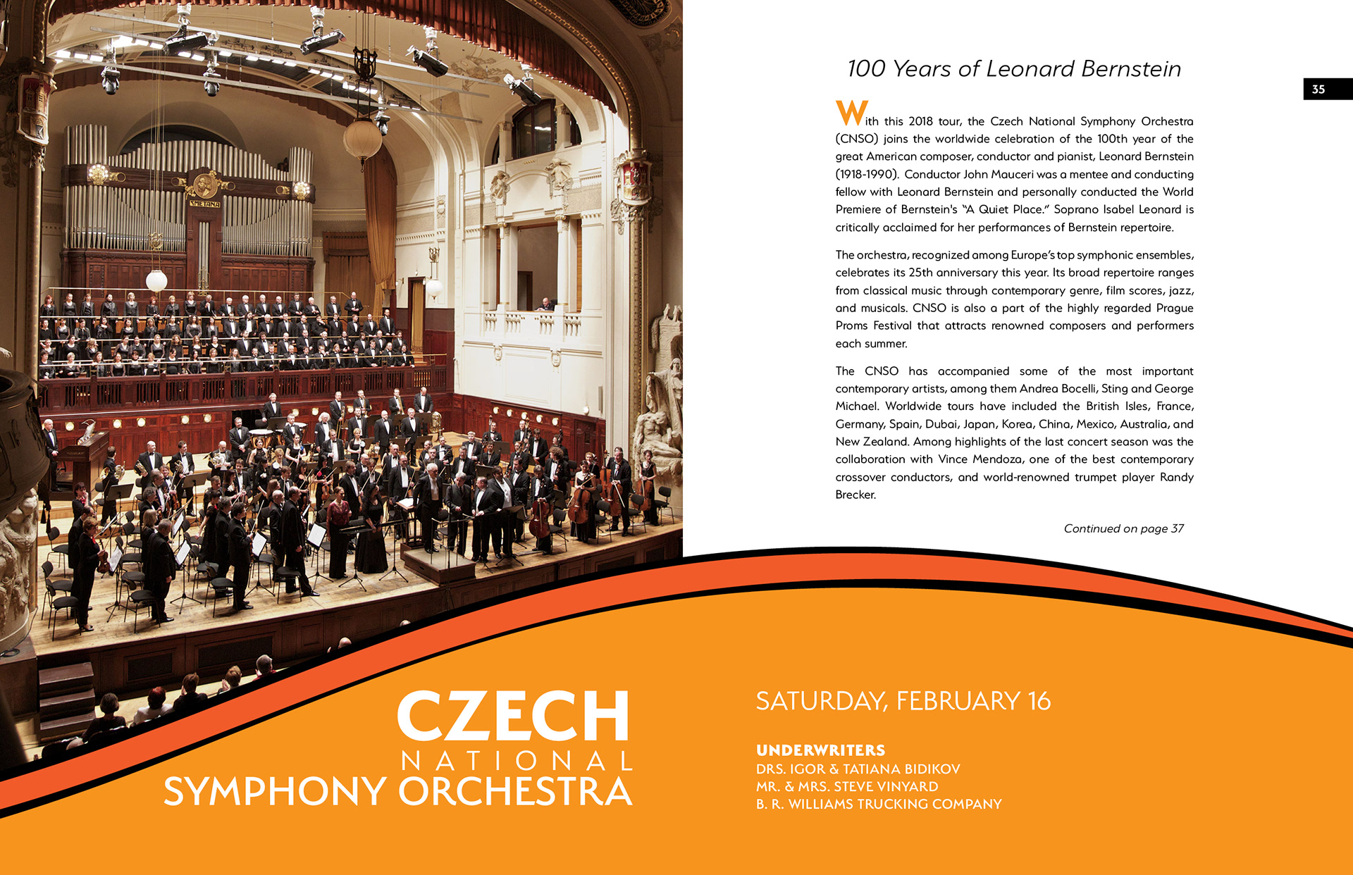
Season Program. Each season, a souvenir season program is published. It includes information on every concert as well as the history of the organization, stories of volunteers and more. This season, I commissioned Susan Roberts, a local artist, to create an illustration for the cover. For inspiration, I showed her Awazu's work as well as the landscape illustration I had created for the charter campaign. Media: magic markers on paper. Below are page spreads from the program showing the layout design and application of graphics and typeface. All images courtesy of the artist/agent.

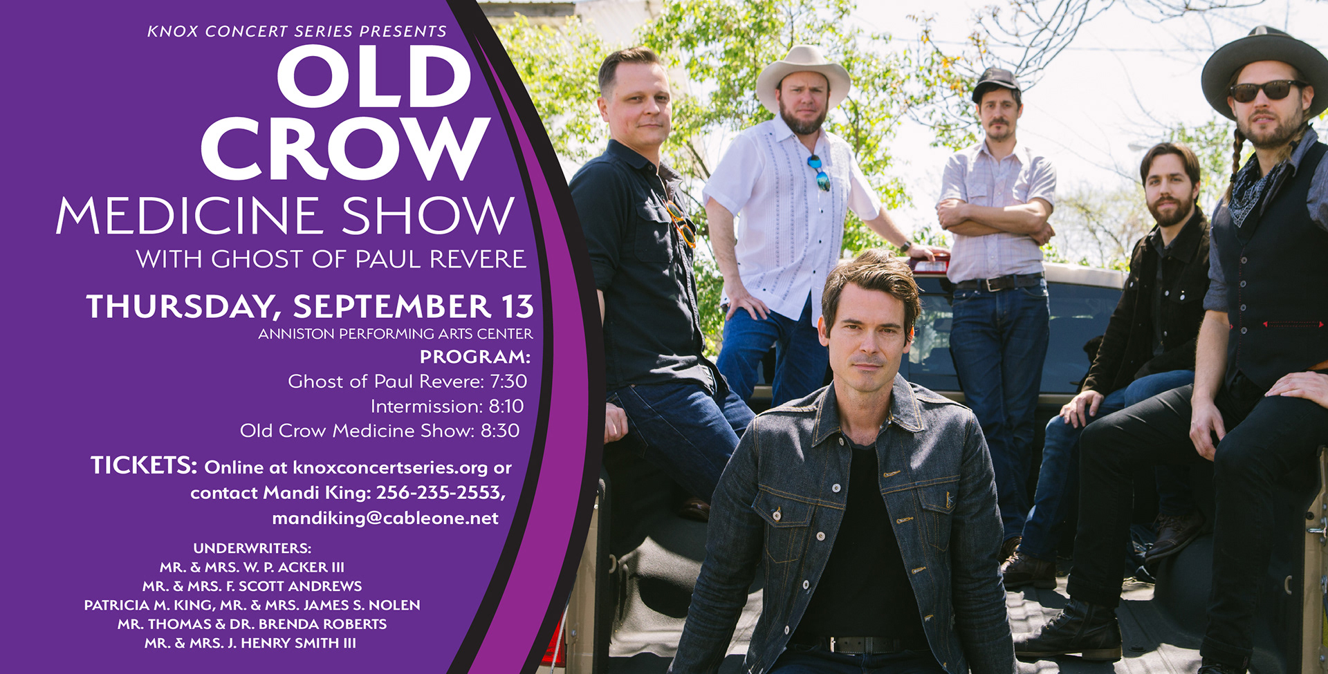
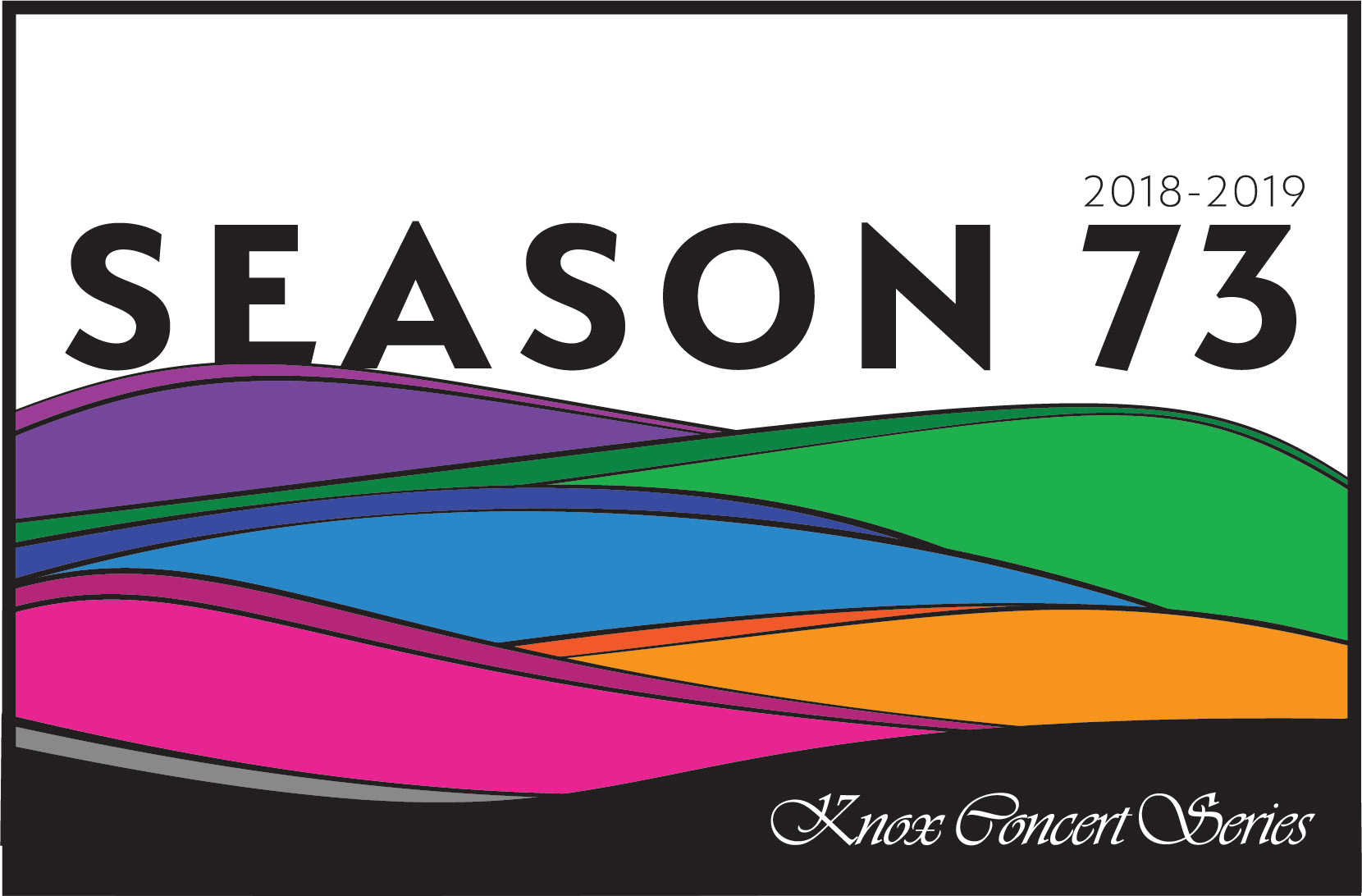
Direct mail postcard (side one of two) reminds ticket holders of the upcoming concert and recognizes concert underwriters. Each concert was associated with a specific color within the landscape.
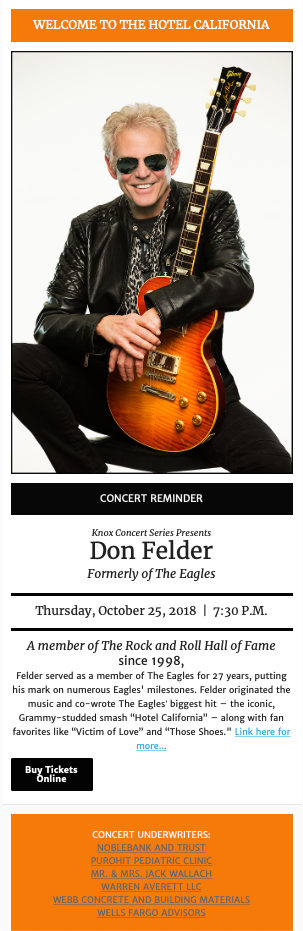
MailChimp E-mailer
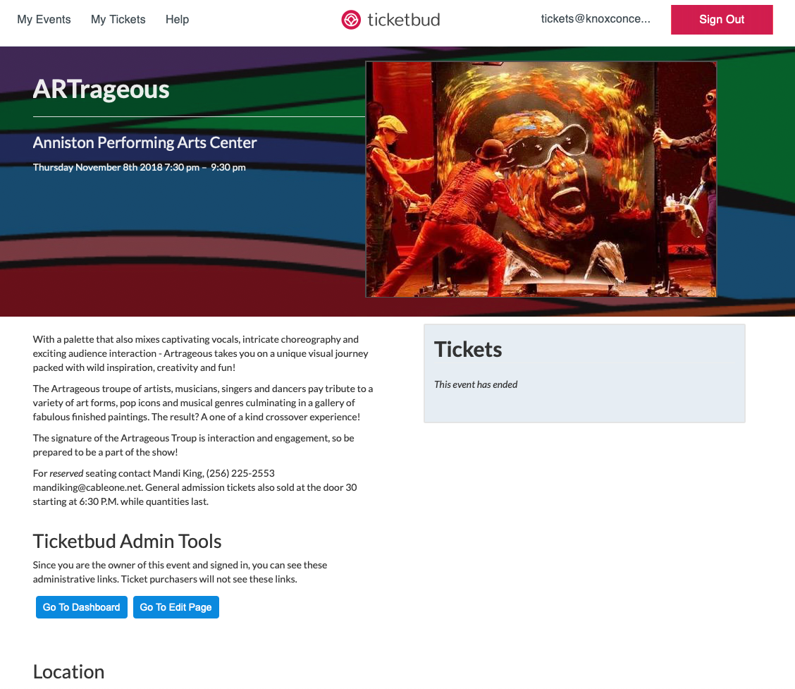
Event page set-up on ticketbud.