Graphic design foundations courses introduce first-year art students to the tools and processes that allow their work to attract, engage and influence viewers.
Student Work Portfolio
Digital Graphic Design Foundations Course student work samples
Initial experiments working with type to create "type dominant" and "image dominant" graphics.
First semester graphic design students are presented "challenges" during each studio session. These are design solutions that require rapid research, ideation, iteration and production -- before the end of class! These daily exercises build the foundation upon which students can then engage in more complex projects. (There's also a lot less time for students to be distracted by their mobile devices.)


"The Year of My Birth" Glyph Set by Kaitlyn Bowman, first semester graphic design student
In this project, students develop glyphs that communicate either sounds or concepts. Basic typography is introduced during the assignment.
Glyph set design by first-year graphic design student Daianera Thompson.
Logo developed for an external client.
Logo for the Urban Turtle Project. Graphic Design Student: Kaitlyn Bowman.
Exploring solutions through the design process
Analogue Graphic Design Foundations Course Student work samples
A final project in an analogue graphic design foundations course: students designed 3-D clocks using the concept derived from their photo stories, which were created earlier in the semester. Following are a few examples:
Concept: Lost Love
Designer: Eric McClendon
Concept: Lost Love
Designer: Eric McClendon
Concept: Togetherness
Designer: Ashley Robertson
Concept: Twist of Fate
Designer: Lee Hamric
Concept: Insomnia
Designer: Taylor Haynes
BeginningGraphic Design, ART 329
Department of Art | Jacksonville State University
Instructor: Susan Robertson, GTA MFA VisualCommunication & Design
Department of Art | Jacksonville State University
Instructor: Susan Robertson, GTA MFA VisualCommunication & Design
Project Brief
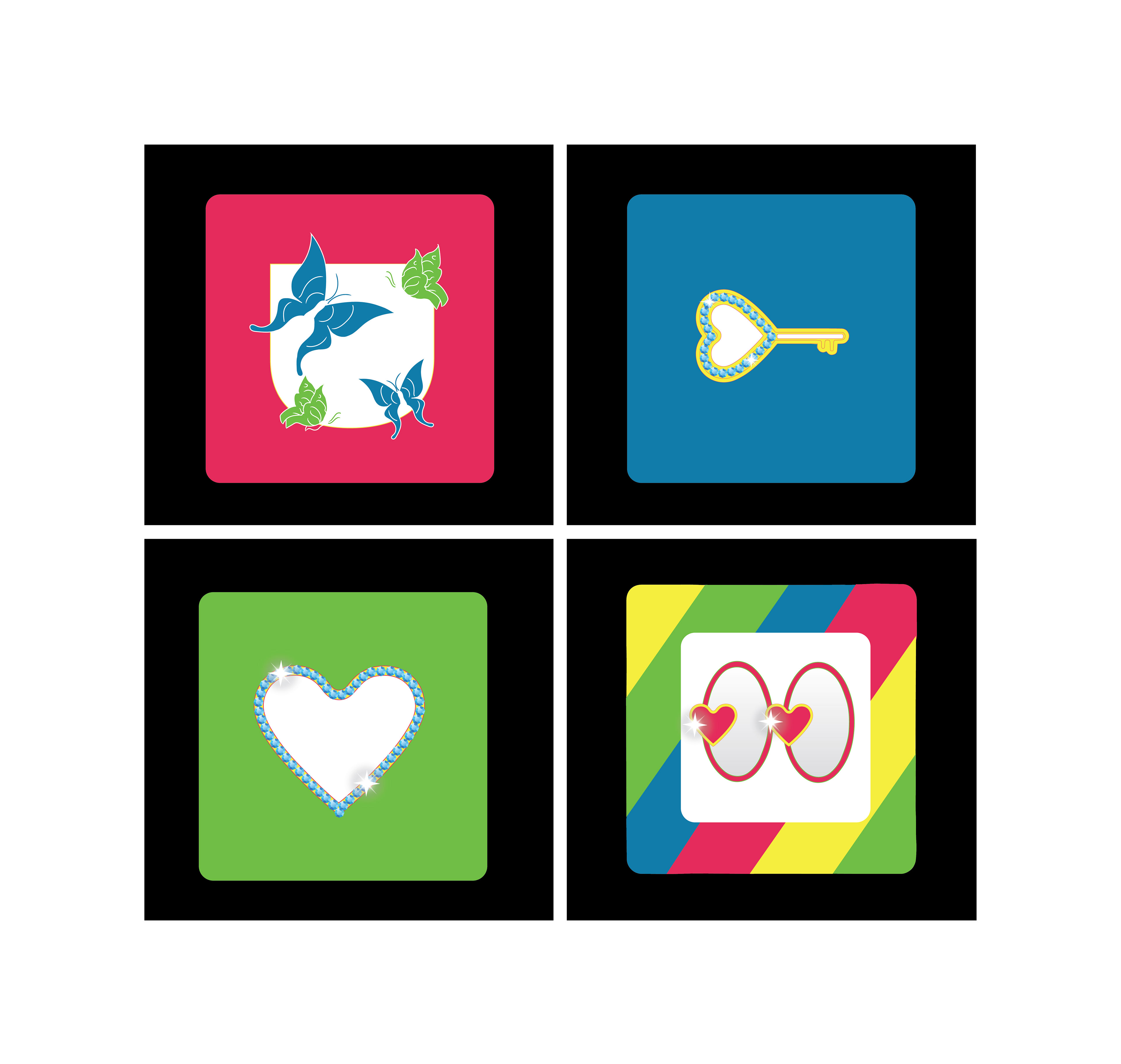
Using the elements and principles of design, develop 4 graphics that communicate the central idea/concept/value/emotion/etc. of a popular* song from the year of your birth. Although each graphic could employ more than one visual principle, it should emphasize one (visually apparent). The four graphics should constitute a “set.”
Using the elements and principles of design, develop 4 graphics that communicate the central idea/concept/value/emotion/etc. of a popular* song from the year of your birth. Although each graphic could employ more than one visual principle, it should emphasize one (visually apparent). The four graphics should constitute a “set.”
Investigate any and all possible angles/approaches to your song: historical, social, personal, emotional, universal.
During critiques, present your work from each stage of the graphic design process.
Format: Each concept is represented in a 5”x 5” image area. Each image is mounted on black foam board in a 4x4 grid with 3” margins (all exterior sides) and ¼” gutter (between images).
*In the top ten on Billboard
Phase 1
· Decision on songto be interpreted (in writing)
· Decision onvisual principles to be used (in writing)
· 80+ thumbnails(about 20 on each image)
· Presentation onprogress (research methods, ideas)
Core Competencies Addressed
· Ability to create/develop visual response to communication problems, including understanding of hierarchy, typography, aesthetics, composition and construction of meaningful images
· Ability to solve communication problems including identifying the problem, researching, analysis, solution generating, prototyping, user testing and outcome evaluation
· Broad understanding of issues related to the cognitive, social, cultural, technological contexts for design
· Understanding of and ability to utilize tools and technology
· Ability to beflexible, nimble and dynamic in practice
· Management/communication skills necessary to function productively in teams
· Ability to construct verbal arguments for solutions that address diverse users/audiences; lifespan issues; and business/organizational operations
Source: American Institute of Graphic Arts, www.aiga.org
Sarah Buxton
Brief: Communicate the concept of a top 10 song from the year of your birth
Song Title: "Another Day in Paradise"
Concept: Life is about choices. Indifference/Avoidance.
Design Principles: Figure-Ground, Closure, Continuation, Contrast
Brief: Communicate the concept of a top 10 song from the year of your birth
Song Title: "Another Day in Paradise"
Concept: Life is about choices. Indifference/Avoidance.
Design Principles: Figure-Ground, Closure, Continuation, Contrast
Wesley Padgett
Brief: Communicate the concept of a top 10 song from the year of your birth. Use the principles of design. Develop a set.
Song Title:
Concept: Conformity
Principles: Closure, Continuation, Figure-Ground
Brief: Communicate the concept of a top 10 song from the year of your birth. Use the principles of design. Develop a set.
Song Title:
Concept: Conformity
Principles: Closure, Continuation, Figure-Ground
Sebastian Mendez
Brief: Communicate the concept of a top 10 song from the year of your birth. Use the principles of design. Develop a set.
Song: "Another Day in Paradise"
Concept: Homelessness is a world-wide problem
Design Principles: Proximity (Grouping), Continuation, Closure, Symmetry
Brief: Communicate the concept of a top 10 song from the year of your birth. Use the principles of design. Develop a set.
Song: "Another Day in Paradise"
Concept: Homelessness is a world-wide problem
Design Principles: Proximity (Grouping), Continuation, Closure, Symmetry
Sara Billion
Exercise: Typeface Design from Personal Handwriting Style
Graphic Design 1 Students
Jacksonville State University
Susan Robertson, GTA
Graphic Design 1 Students
Jacksonville State University
Susan Robertson, GTA
Wesley Padgett
Katrina Collins
Project: "Type Translation"
Beginning Graphic Design I Students
Jacksonville State University | Fall 2012
Susan Robertson, GTA
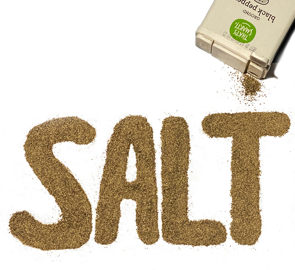
After completing the classroom exercise on designing a typeface from your handwriting, create a typeface from anything – cereal, tools, other typefaces, jewelry, bark … well, you get it: anything, just be certain to apply what you learned in the exercise.
Use any 2D medium (photography, ink, paint, etc.) to capture it. It should be reproducible.
With your new typeface, “write” a word or phrase whose meaning reinforces the design/concept of the typeface -- a visual pun. For instance, write the word “goodness” with honey or the word “contemplate” with a typeface that looks like brains.
Note:
Strong use of the principles of design is expected.
Follow the graphic design process and be prepared to show your process during critique.
Finished format: applied to or executed on 11 x 14 illustration board
Wesley Padgett
Photograph
Photograph
Katrina Collins
Pen and pencil on illustration panel
info to come
Sara Billion
Photograph of activated glow sticks